Create great components
for your next project
Set of basic Figma and code components. Sane defaults. Framework-agnostic. Based on Tailwind CSS. Open source. Customisable with AI.
See docs

| Task | Priority | Tags | |
|---|---|---|---|
| Redesign form inputs in UI Kit | High |
Components
|
|
| Audit button variants in Figma | Medium |
Tokens
|
|
| Update shadow tokens | Low |
Tokens
|
|
| Redesign radio buttons | Low |
Components
|
Primary
Danger
Secondary
Outline
Ghost
Link
Upgrade account
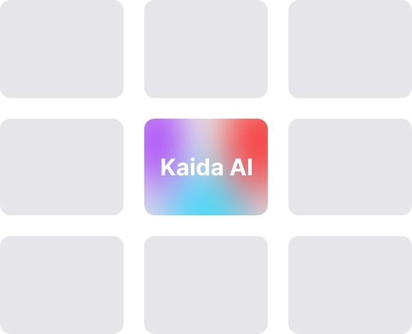
Turn on Kaida
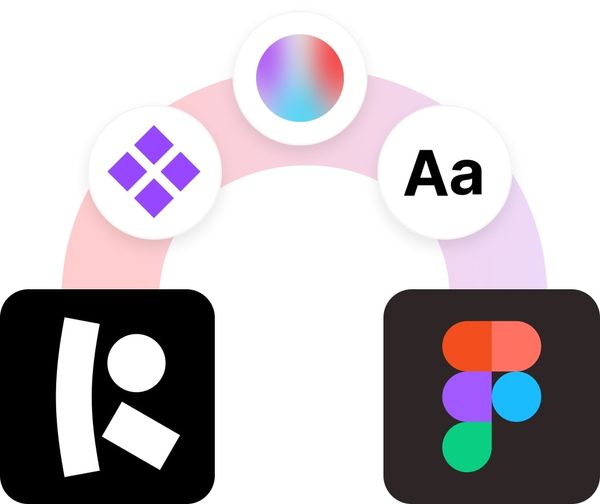
Discuss. Design. Develop. Repeat!
Bridging the gap between des & dev
We enable designers and developers to use the same components and help stakeholders speak the same language.

<button type="button"
  class="whitespace-nowrap py-8px px-16px text-btn2 rounded-8px text-white dark:text-black-900 border disabled:bg-black-200 disabled:border-black-200  bg-black dark:bg-white border-black hover:bg-black-700 hover:border-black-700 active:bg-black-500 active:border-black-500 dark:hover:bg-black-200 dark:hover:border-black-200 dark:active:bg-black-400 dark:active:border-black-400">
  Primary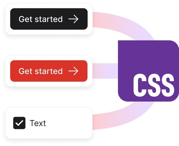
</button>Work Smart. Iterate Fast.
Speed up your workflow
Kaida features help your team save time, move faster, and communicate better.
Generate components. Discuss with teammates. Review visual.
Import to Figma. With color & text styles.
All components automatically created in code
Icon packs included
Streamlined Design, Ready for Code.
Well-thought-out system of components
Thoughtful naming, states, and variants in Figma, plus open-source component code for development.
